fish dataset
Niche Overlap Analysis Using nicheROVER and Stable Isotope Data
Multivariate Analysis
Abstract
Stable isotope analysis (SIA) provides numerous information while assessing species’ ecological niche, the R package nicheROVER offers an insightful analysis using stable isotope data.
Part of this note is taken from the course Community Ecology offered by University of Hamburg for M.Sc. Biology program and led by Dr. Paula Cabral Eterovick.
The cover image is credited to Museums Victoria on Unsplash.
Niche Overlap
In Ecological Niche, we talked about the basic ideas of ecological niches and niche overlap. Understanding the niche overlap patterns, both intraspecific and interspecific, can help us better understand many topics, such as:
Evolutionary:
- Sexual Dimorphism by studying differences in resource utilization between males and females of the same species.
- Speciation Process by studying niche partitioning between sister taxa or subspecies.
Conservation:
- Impact of Invasive Species by examining niche overlap between native and invasive species.
- Ecological Guild by understanding niche overlap within a group sharing the same or similar functional traits (e.g. pollinator communities).
However, comparing niches among multiple species is challenging, as I mentioned earlier, since ecological data are almost always multidimensional.
nicheROVER
The package nicheROVER provides a new probabilistic method for quantifying n-dimensional ecological niche and niche overlap (Swanson et al. 2015). The script demonstrated here is written by Martin Lysy, Heidi Swanson (see here), and is also used in their publication.
fish is a fish stable isotope dataset included in the package, containing values for three stable isotopes (N-15, C-13, S-34) measured in the muscle tissue of four Arctic fish species (ARCS, BDWF, LKWF, LSCS). More details can be found from the documentation (?fish) or in the publication.
What is SIA?
Stable isotope analysis (SIA) is a powerful tool in ecological niche analysis. Many physicochemical and biochemical processes are sensitive to differences in the dissociation energies of molecules, which often depend on the mass of the elements from which these molecules are made. Thus, the isotopic composition of many materials (expressed as \(\delta\)-values, indicating the amount ratio of certain isotope to a standard value), including the tissues of organisms, often contains a label of the process that created it (Newsome et al. 2007). These “signatures” could provide information about their ecological roles and interactions.
| Gradient | Isotope system | High \(\delta\)-values | Low \(\delta\)-values |
|---|---|---|---|
| Trophic level | \(\delta ^{13} C\)/\(\delta ^{15} N\) | High levels | Low levels |
| C3-C4 Vegetation | \(\delta ^{13} C\) | C4 plants | C3 plants |
| Marine-terrestrial | \(\delta ^{15} N\)/\(\delta ^{13} C\)/\(\delta ^{34} S\) | High levels | Low levels |
Bayesian Workflow
Bayesian theorem
Van De Schoot et al. (2021) described the foundational idea of the Bayesian statistics as follows:
Bayesian statistics is an approach to data analysis based on Bayes’ theorem, where available knowledge about parameters in a statistical model is updated with the information in observed data. The background knowledge is expressed as a prior distribution and combined with observational data in the form of a likelihood function to determine the posterior distribution.
This means we make an initial estimation of our parameters (prior distribution), then observe data and update the model (posterior distribution). Bayes’ theorem, which this approach is based on, is mathematically stated as following:
\[ P(A|B)=\frac{P(B|A)P(A)}{P(B)} \]
where,
- \(A\) and \(B\) are events and \(P(B)\neq 0\),
- \(P(A|B)\): the probability of event \(A\) occurring given that \(B\) is true. It is also called the posterior probability (briefly posterior) of \(A\) given \(B\).
- \(P(B|A)\) is also a conditional probability: the probability of event \(B\) occurring given that \(A\) is true. It can also be interpreted as the likelihood of \(A\) given a fixed \(B\) because \(P(B|A)=L(A|B)\). (\(L\): likelihood function)
- \(P(A)\) and \(P(B)\) are the probabilities of observing \(A\) and \(B\) respectively without any given conditions; they are known as the prior probability and marginal probability.
Why Bayesian Statistics?
Bayesian statistics is a different framework and approach on statistical analysis. Both classical and Bayesian inference, while trying to model data, have own advantages and disadvantages. Bayesian inference is generally employed whenever uncertainty comes into play:
There is also a practical advantage of the Bayesian approach, which is that all its inferences are probabilistic and thus can be represented by random simulations. For this reason, whenever we want to summarize uncertainty in estimation beyond simple confidence intervals, and whenever we want to use regression models for predictions, we go Bayesian.
― Gelman, Hill, and Vehtari (2024), P. 16
Swanson et al. (2015) pointed out a viewpoint from the traditional niche overlap analysis that might introduce problems: the geometric approach doesn’t account for uncertainty and also lacks direction. This is well illustrated by Fig. 1 in the publication:

By inviting the variance of the niche probability distribution, it now also differentiates the overlap in directions, which means the probability of a species A falling into species B’s niche is not equal to that of species B falling into species A’s niche. Since this perspective starts to consider probability in the models, a Bayesian workflow will provide more reliable and robust analysis.
Random Vector and Multivariate Normal Distribution
Given an individual statistical unit, in our case, the niche described by three isotope ratios, a random vector is a group of variables that describes this mathematical system. Which is again, in our case, the three values of the isotope ratio. The distribution of each component of the random vector together forms a multivariate distribution.
When dealing with univariate (one-dimensional) analysis, we often assume that the variable is normally distributed. We do likewise even with multivariate analysis. The multivariate normal distribution is a generalization of the univariate normal distribution into higher dimensions, but it’s not as simple as all components of the random vector being normal. It also requires every linear combination of arbitrary two components in the system to be normally distributed (bivariate normal distribution), which is not always true even if every single variable is normal on its own. This is where the covariance matrix comes into play. Normal distribution is described by two variables: mean and standard deviation (sd), with the latter being simply the square root of the variance.
Covariance and covariance matrix
Covariance is a measure of the joint variability of two variables. The sign of the covariance shows the tendency, i.e. one of the three possible linear relationships between two variables, which are:
- negative linear relationship, covariance is < 0
- no linear relationship, covariance is around 0
- positive linear relationship, covariance is > 0
The variance is a special case of covariance in which the two variables are identical. Covariance itself is sensitive to the scale of the data, and it does not provide information of on the extent to which the two variables correlate with each other and how well the linear correlation fits the data. All these characteristics make covariance difficult to interpret, but it has become an important stepping stone for many subsequent analysis, such as PCA, correlation analysis, etc.
A covariance matrix is a square matrix giving the covariance between each pair of elements, which is always symmetric, and the diagonal elements represent the variance of each variable. The covariance matrix describes the joint behavior of every linear combination of two variables, analogue to univariate normal distribution, a covariance matrix (\(\Sigma\)) and a mean (\(\mu\)) are used to described a multivariate normal distribution.
Conjugate Prior
Jackson et al. (2011) suggested that the normal distribution is generally appropriate when dealing with stable isotope ratios, and this gives us a way to simplify the analysis by taking advantage of the conjugate prior.
A conjungate prior is a certain prior distribution that, when applied to a certain likelihood function, results in a posterior distribution from the same distribution family. For example, in univaraite analysis, a normal prior and a normal likelihood function results a normal posterior. In our case, the conjugate prior for the multivariate normal is the normal-inverse-wishart (NIW) distribution. It can be considered in two parts: the mean follows a normal distribution and the covariance follows an inverse-Wishart distribution. NIW is commonly used as the prior distribution when modeling a multivariate normal distribution where the means and the covariances are unknown.
The probability of a random observation of a isotope ratio (\(x\)) belongs to species \(s\) is following a normal distribution.
\[ P(x |\text{species}=s) \backsim N(\mu_s \, , \Sigma_s) \]
Monte Carlo with niw.post()
All the prior knowledge we just went through, from basic Bayesian inference to the NIW distribution, is to understand the very two lines of code that implemented the Bayesian workflow into the analysis.
nsamples <- 1000
fish.par <- tapply(1:nrow(fish), fish$species,
            function(ii) niw.post(nsamples = nsamples, X = fish[ii,2:4]))
niw.post() uses a data matrix (X) as observation data, calculate the posterior distribution, and then draws a set of means and covariance matrices of a possible multivariate distribution, which includes the prior and our observation data. The main idea is that because analytically working with posterior multivariate distribution is too impractical, so we employ the :Monte Carlo approach to have a view of the posterior. We use tapply() to separately apply 1000 times of niw.post() on each fish species.
This results in a list of 4 lists (species) of 2 matrices (mu and Sigma), where the mu matrix has a dimension of 1000 (sampling times) x 3 (number of variables), and the Sigma matrix has a dimension of 1000 (sampling times) x 3 x 3 (one slice = one covariance matrix).
This particular data structure is critical for later application of niche.par.plot(), see ?nichr.par.plot for more.
Niche Parameters
niche.par.plot() allows us to have a overview on Monte Carlo simulation of the posterior multivariate distribution of our \(\mu\) and \(\Sigma\). It shows the probability density curve of each variable. Use plot.index, plot.mu or plot.Sigma to select which \(\mu\) or \(\Sigma\) to plot, or simply use plot.mu = TRUE, plot.Sigma = TRUE to display all. See details in the document.
clrs <- c('#348E8C', '#732C02', '#BF0404', '#F29F05') # colors for each species

# mu1 (del15N), mu2 (del13C), and Sigma12
par(mar = c(4, 5, .5, .1)+.1, oma = c(0,0,0,0), pty="s", mfrow = c(1,3))
niche.par.plot(fish.par, col = clrs, plot.index = 1)
niche.par.plot(fish.par, col = clrs, plot.index = 2)
niche.par.plot(fish.par, col = clrs, plot.index = 1:2)
legend("topleft", legend = names(fish.par), fill = clrs)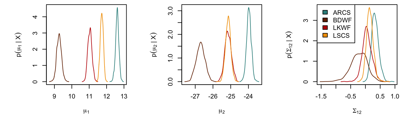
2-D Ellipse Projection
To deal with n-dimensional niche regions (NR), Swanson et al. (2015) reduced them into 2-dimensional space using probabilistic projection, which is to differentiate from geometric projection. A 2-dimensional probabilistic projection of an n-dimensional NR is simply the NR calculated by the projected 2 axes (Jackson et al. 2011; Swanson et al. 2015). Fig. 2 from Swanson et al. (2015) clearly demonstrates and explains the different outcomes.

For the sake of clarity, we only use 10 simulations here. niche.plot() generates three types of plot:
- Univariate distribution density curves, i.e. smoothed histogram.
- Bivariate scatter plots.
- 2-D projection of NR using simulation data, displayed in ellipse plots.
From the first two plot types, we could confirm the assumption that the isotope ratios are generally normal. The ellipse plots give us a better view of each species’ NR and the overlap situation.
nsamples <- 10
fish.par <- tapply(1:nrow(fish), fish$species,
            function(ii) niw.post(nsamples = nsamples, X = fish[ii,2:4]))

# format data for plotting function
fish.data <- tapply(1:nrow(fish), fish$species, function(ii) X = fish[ii,2:4])

niche.plot(niche.par = fish.par, niche.data = fish.data, pfrac = .05,
           iso.names = expression(delta^{15}*N, delta^{13}*C, delta^{34}*S),
           col = clrs, xlab = expression("Isotope Ratio (per mil)"))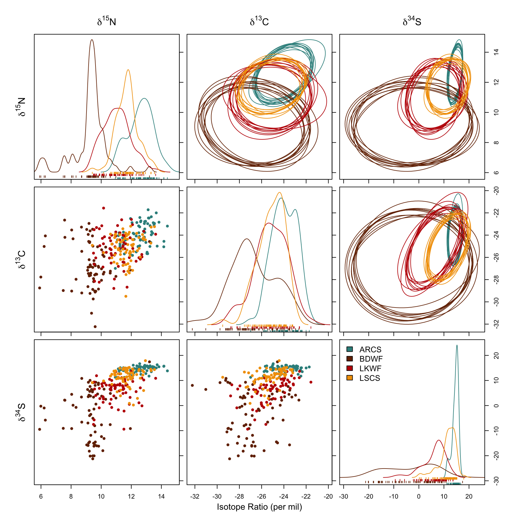
It’s a bit overwhelming plot. Take time to understand it.
Estimate Niche Overlap
With overlap() we can have a more accurate and robust inference of overlapping among the species. The accuracy of the estimation can be improved by increasing nprob. The generated plot shows pairwise niche overlaps (now we have directions!), which displays the probability distribution of species A (along rows) fallen inside the niche of species B (along columns), with indication of the mean and 95% credible interval.
Be careful not to confuse two “95%” here - one means that we use 95% of the niche region to calculate overlap, which is specified in overlap() with alpha = 0.95; the other is the 95% credible interval of the probability distribution displayed in each plot. There is a difference to spot between plots using 95% or 99% of the niche region.
nsamples <- 1000
fish.par <- tapply(1:nrow(fish), fish$species,
            function(ii) niw.post(nsamples = nsamples, X = fish[ii,2:4]))

# 95% niche region
over.stat95 <- overlap(fish.par, nreps = nsamples, nprob = 1000, alpha = 0.95)
overlap.plot(over.stat95, col = clrs, mean.cred.col = "#024873", equal.axis = TRUE, xlab = "Overlap Probability (%) -- Niche Region Size: 95%")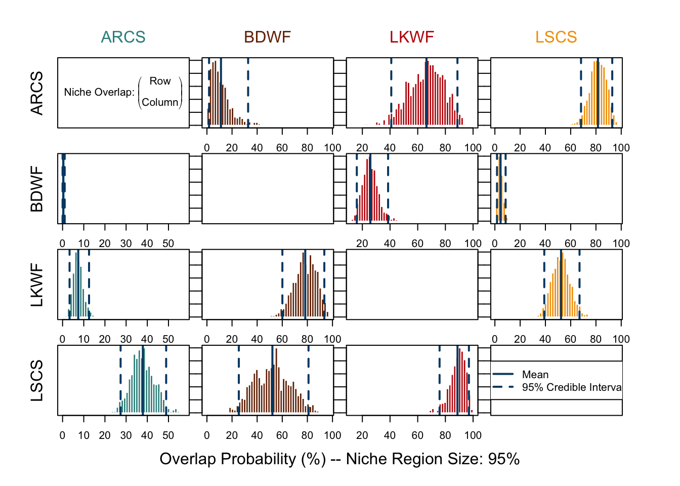
# 99% niche region
over.stat99 <- overlap(fish.par, nreps = nsamples, nprob = 1000, alpha = 0.99)
overlap.plot(over.stat99, col = clrs, mean.cred.col = "#024873", equal.axis = TRUE, xlab = "Overlap Probability (%) -- Niche Region Size: 99%")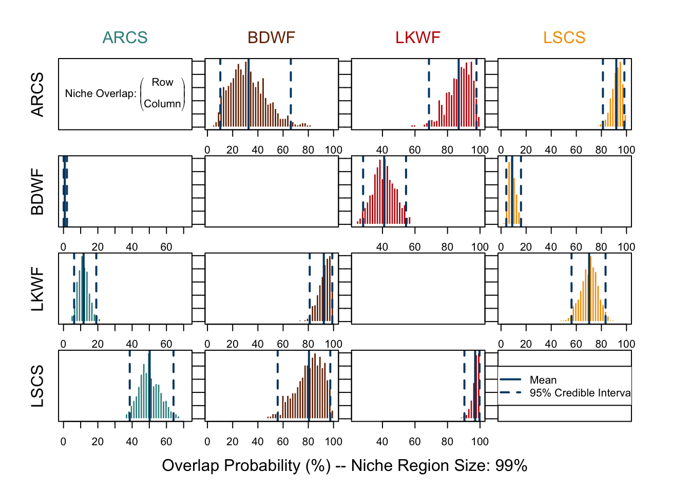
By printing out the returned value from overlap(), numeric results can also be shown.
Penguins
Let’s run the niche overlap analysis on another dataset. There’s a datasets of 3 Pygoscelis species nesting along the Palmer Archipelago near Palmer Station, containing structural measurements, two isotope ratios, and basic metadata. Isotope data was collected from blood samples, and additional records of whether the sampled individuals have completed their clutch were documented.
adeliae <- readRDS("biology-research/community-ecology/assets/data/219.5.rds") %>% mutate(Species = "P. adeliae")
papua <- readRDS("biology-research/community-ecology/assets/data/220.7.rds") %>% mutate(Species = "P. papua")
antarcticus <- readRDS("biology-research/community-ecology/assets/data/221.8.rds") %>% mutate(Species = "P. antarcticus")

penguin <- bind_rows(adeliae, papua, antarcticus)

comp.penguin <- penguin %>% select(c(1:9, 13:14, 17, 10:12, 15:16)) %>% filter(complete.cases(.))

paged_table(comp.penguin)penguin dataset
To consider potential sexual dimorphisms within species, we will also differentiate the observations by sex.
comp.penguin <- comp.penguin %>%
    filter(Sex != "" & Sex != ".") %>%
    mutate(Species = factor(Species), Sex = factor(case_when(
        Sex == "FEMALE" ~ "F",
        Sex == "MALE" ~ "M"
    ))) %>%
    mutate(cat = factor(paste(Species, Sex, sep = " - ")))

# Take a look at the n in each group
summary(comp.penguin$cat)
P. adeliae - F P. adeliae - M P. antarcticus - F P. antarcticus - M
71 68 34 33
P. papua - F P. papua - M
58 60 As mentioned in Table 2, \(\delta ^{13} C\) and \(\delta ^{15} N\) can be used to assess the trophic level of the species. We first analyze the niche using only these two values:
Code
# Run the analysis only with isotope data
nsamples <- 10
pen.par <- tapply(
    1:nrow(comp.penguin),
    comp.penguin$cat,
    function(ii) niw.post(nsamples = nsamples, X = comp.penguin[ii, 16:17]))

# format data for plotting function
pen.data <- tapply(1:nrow(comp.penguin), comp.penguin$cat, function(ii) X = comp.penguin[ii, 16:17])

clrs <- c("#023059", "#0477BF", "#8C3E7F", "#8872A6", "#F24130", "#F2A71B")

par(mfcol = (c(6, 6)))
niche.plot(niche.par = pen.par, niche.data = pen.data, pfrac = .05,
           iso.names = c(expression(delta^{15}*N), expression(delta^{13}*C)),
           col = clrs, xlab = expression("Isotope Ratio (per mil)"))

nsamples <- 1000
pen.par <- tapply(
    1:nrow(comp.penguin),
    comp.penguin$cat,
    function(ii) niw.post(nsamples = nsamples, X = comp.penguin[ii, 16:17]))

# 95% niche region
over.stat95 <- overlap(pen.par, nreps = nsamples, nprob = 1000, alpha = 0.95)
overlap.plot(over.stat95, col = clrs, mean.cred.col = "#024873", equal.axis = TRUE, xlab = "Overlap Probability (%) -- Niche Region Size: 95%", species.names = c("P. adeliae - F", "P.adeliae - M", "P. antarcticus - F", "P. antarcticus - M", "P. papua - F", "P. papua - M"))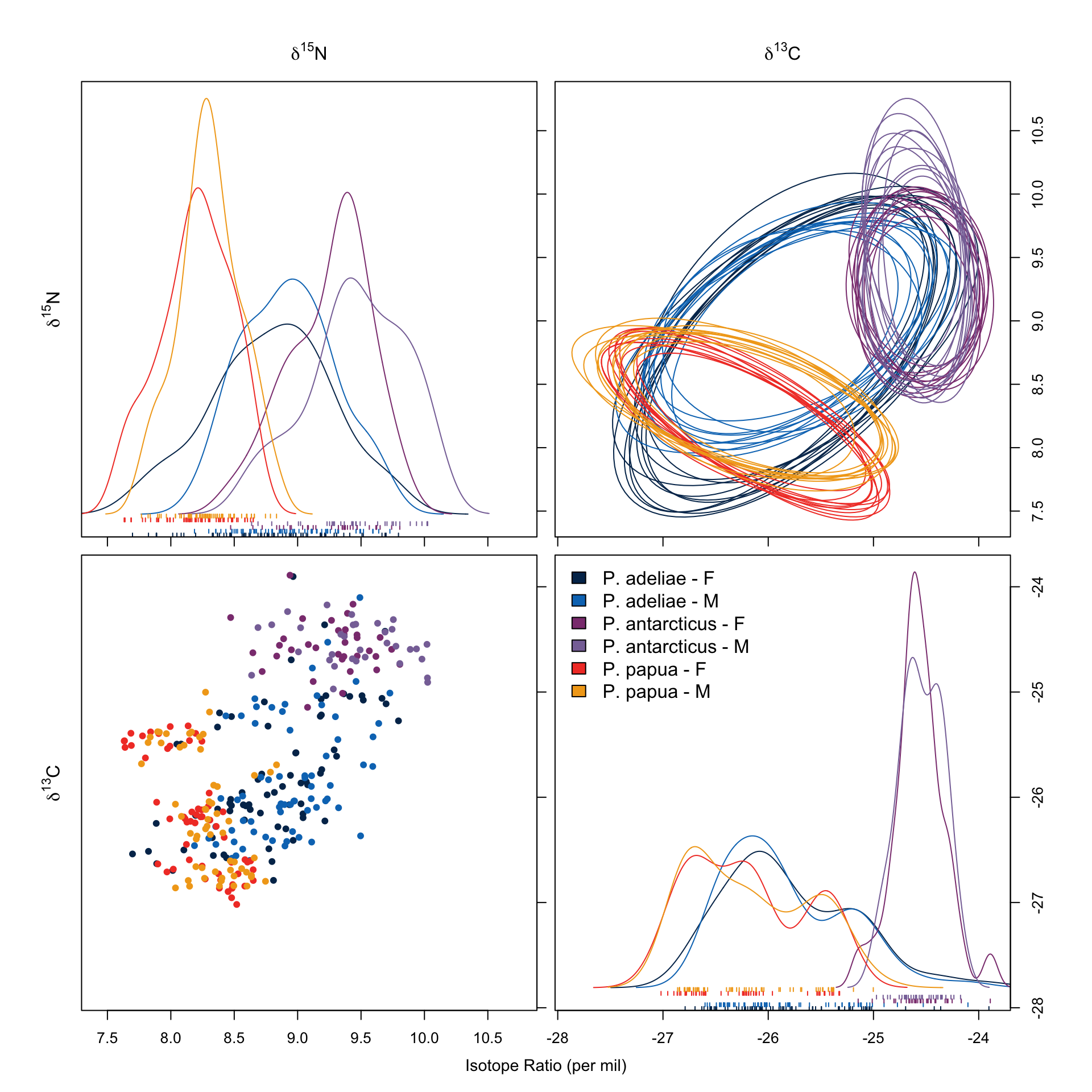
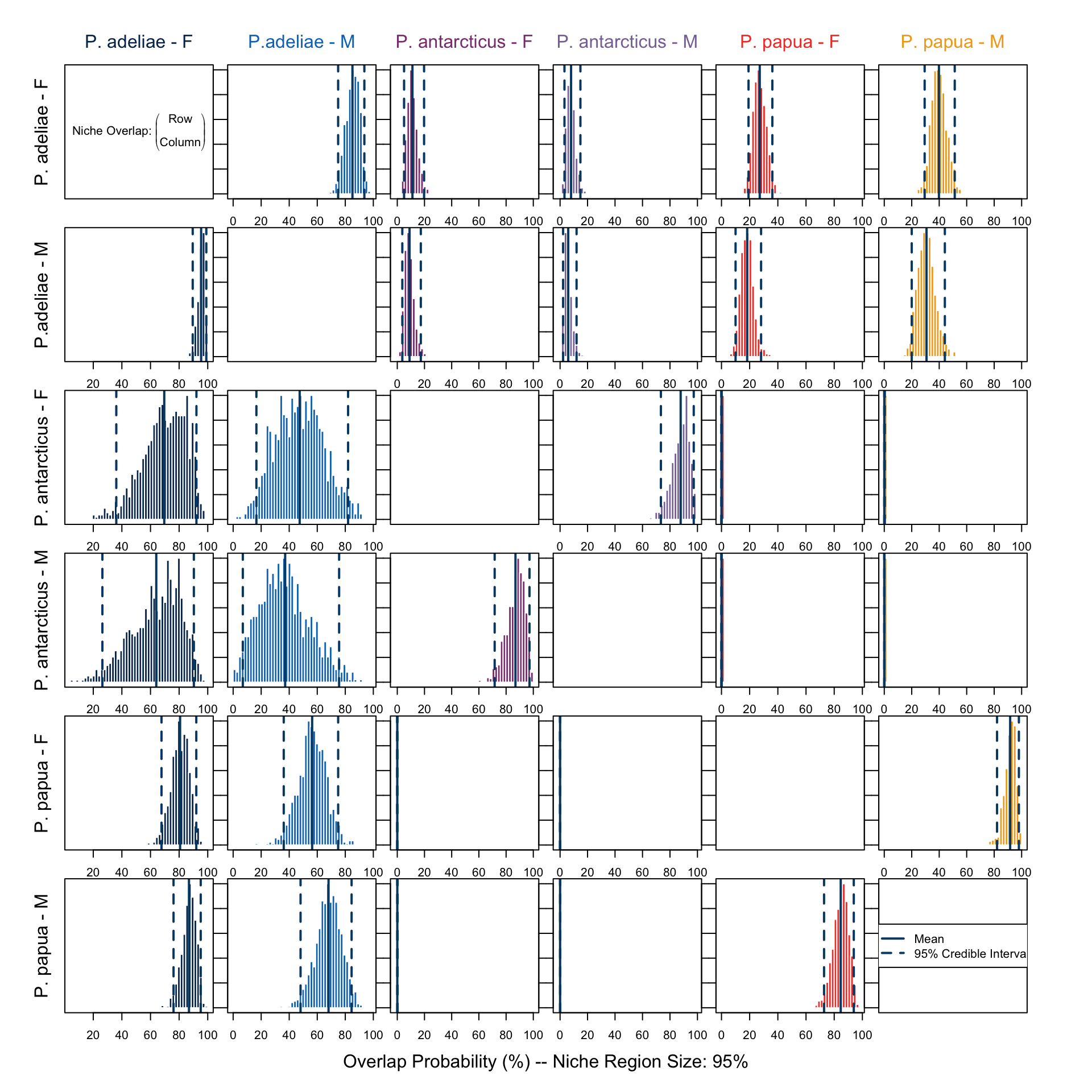
In Figure 7 we saw no remarkable differences between sexes within each species. We also noticed that P. adeliae has the largest niche region and it overlaps with both the others. This is also shown in Figure 8.
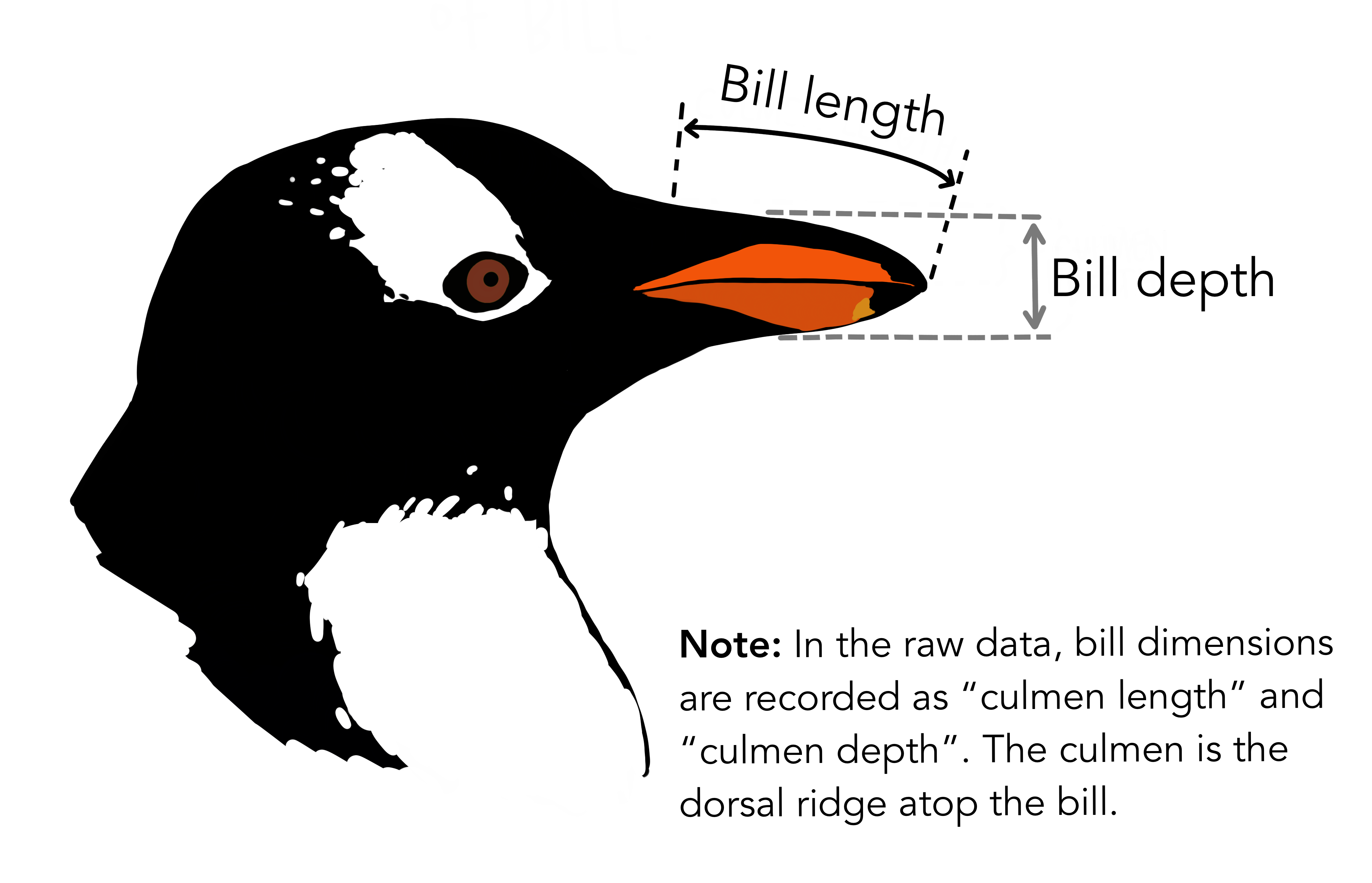
Then, we combine isotope data with two structural measurements, culmen length and culmen depth, whose functionality should be strongly associated with their diet, to run the analysis again.
Code
# Run the analysis with culmen size data and isotope data
nsamples <- 10
pen.par <- tapply(
    1:nrow(comp.penguin),
    comp.penguin$cat,
    function(ii) niw.post(nsamples = nsamples, X = comp.penguin[ii, c(13:14, 16:17)]))

# format data for plotting function
pen.data <- tapply(1:nrow(comp.penguin), comp.penguin$cat, function(ii) X = comp.penguin[ii, c(13:14, 16:17)])

clrs <- c("#023059", "#0477BF", "#8C3E7F", "#8872A6", "#F24130", "#F2A71B")

par(mfcol = (c(6, 6)))
niche.plot(niche.par = pen.par, niche.data = pen.data, pfrac = .05,
           iso.names = c("Culmen length", "Culmen depth", expression(delta^{15}*N), expression(delta^{13}*C)),
           col = clrs, xlab = expression("Isotope Ratio (per mil)"))

nsamples <- 1000
pen.par <- tapply(
    1:nrow(comp.penguin),
    comp.penguin$cat,
    function(ii) niw.post(nsamples = nsamples, X = comp.penguin[ii, c(13:14, 16:17)]))

# 95% niche region
over.stat95 <- overlap(pen.par, nreps = nsamples, nprob = 1000, alpha = 0.95)
overlap.plot(over.stat95, col = clrs, mean.cred.col = "#024873", equal.axis = TRUE, xlab = "Overlap Probability (%) -- Niche Region Size: 95%", species.names = c("P. adeliae - F", "P.adeliae - M", "P. antarcticus - F", "P. antarcticus - M", "P. papua - F", "P. papua - M"))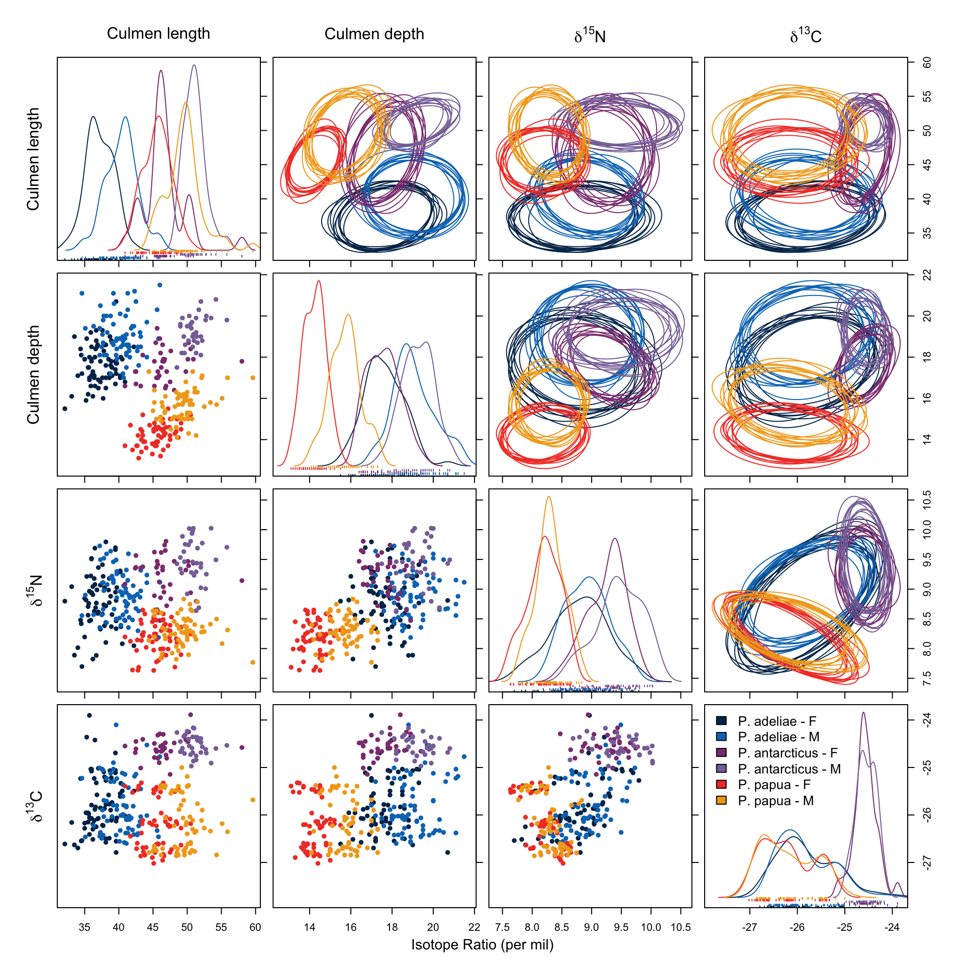
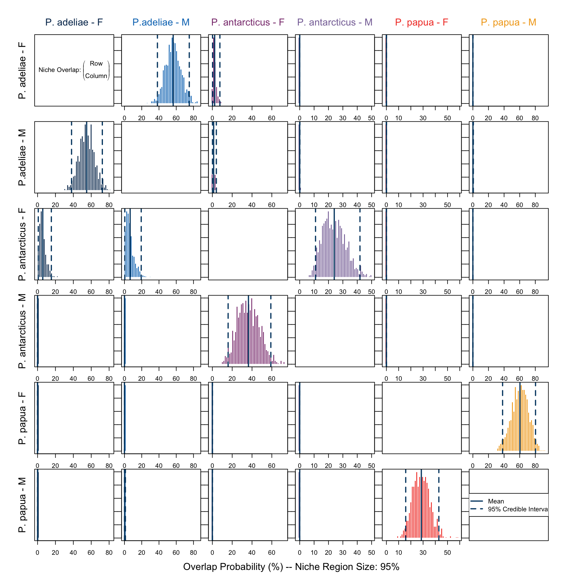
In Figure 9 we notice that both in culmen length and depth, a notable sexual dimorphism is present, and this has formed different niche regions among the groups. The overlap in niche region defined by this data subset (Figure 10) shows, however, different results than those which only utilized isotope signatures (Figure 8). The overlap in all groups and directions between P. papua and P. adeliae is gone, suggesting that their diets have similar \(\delta ^{13} C\) and \(\delta ^{15} N\) signatures, but the prey is probably not the same, since they evolved different functional traits in bill structure. This is more obvious in Figure 9, there is no overlap in niche region described by culmen depth and length between the two species.
On the other hand, female individuals of P. antarcticus remain the only group which has a notable overlap with other groups, namely both sexes of P. adeliae. Gorman, Williams, and Fraser (2014), who conducted the study utilizing this data, suggested, regarding their \(\delta ^{15} N\) signature, that the female P. antarcticus might rely more on a certain type of prey, which might then overlap with P. adeliea’s menu. This might also be a reason for the decreased breeding success.
clutch <- comp.penguin %>% group_by(Species) %>% summarise(complete_clutch = round(sum(Clutch.Completion == "Yes")/sum(!is.na(Clutch.Completion))*100, 2))
clutch
# A tibble: 3 × 2
Species complete_clutch
<fct> <dbl>
1 P. adeliae 90.6
2 P. antarcticus 79.1
3 P. papua 94.1And at last, these are our adorable guests:

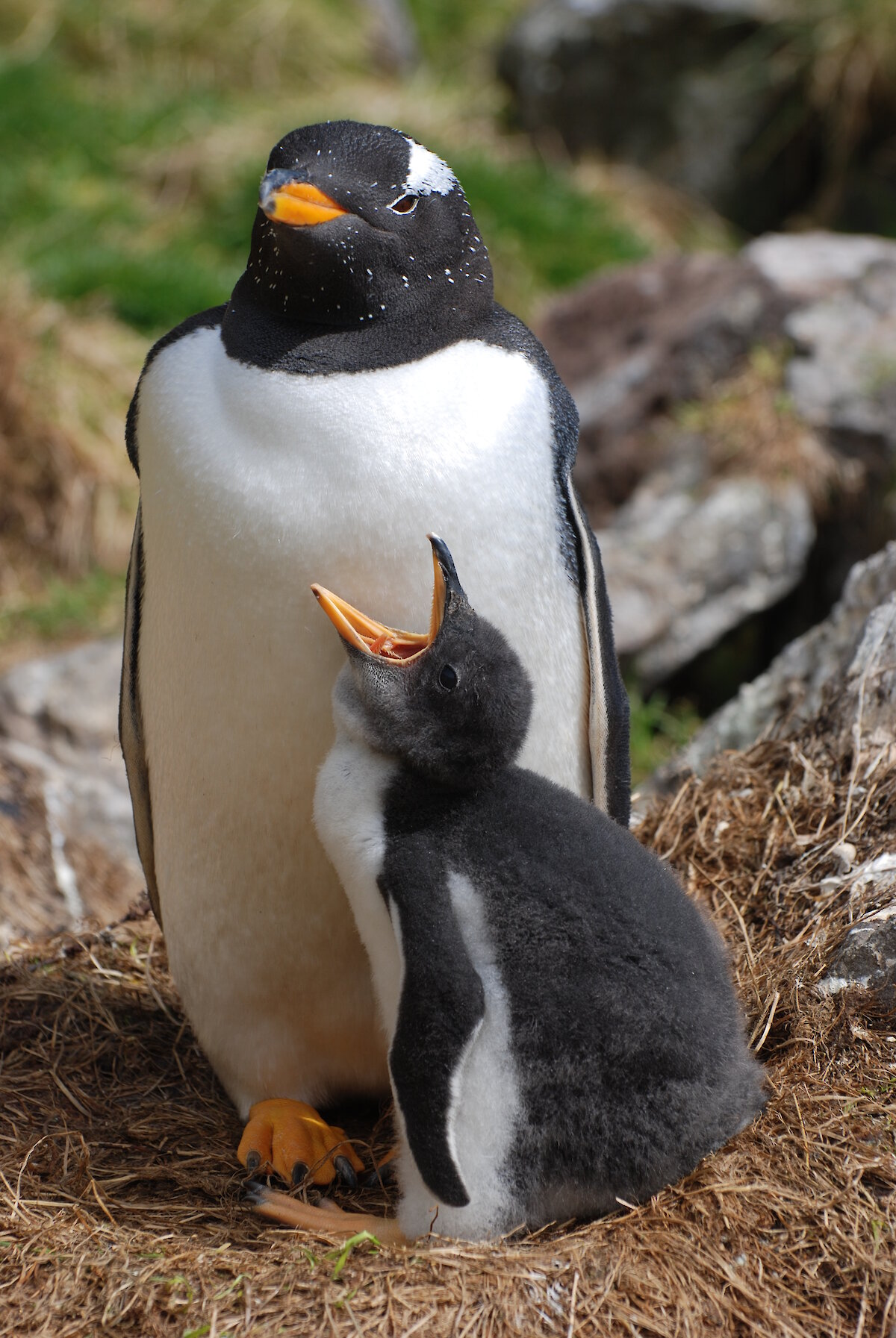

By the way, if anyone ever wondered – yes, this is the exact same dataset they used to produce the palmerpenguins package. I found the data at EDI Data Portal and didn’t notice until I attached the images, because these three guys showing up at the same time is weirdly familiar to me. The dataset is therefore available by simply attaching the package. If you are interested in what more detailed results people have found with these data, you should check the paper from Gorman, Williams, and Fraser (2014).
![]()
Reference
Gelman, Andrew, Jennifer Hill, and Aki Vehtari. 2024. “Regression and Other Stories (Corrections up to 26 Oct 2023) Please Do Not Reproduce in Any Form Without Permission,” July. https://avehtari.github.io/ROS-Examples/.
Gorman, Kristen B, Tony D Williams, and William R Fraser. 2014. “Ecological Sexual Dimorphism and Environmental Variability Within a Community of Antarctic Penguins (Genus Pygoscelis).” PLOS ONE 9 (3). https://doi.org/10.1371/journal.pone.0090081.
Jackson, Andrew L., Richard Inger, Andrew C. Parnell, and Stuart Bearhop. 2011. “Comparing Isotopic Niche Widths Among and Within Communities: SIBER - Stable Isotope Bayesian Ellipses in R: Bayesian Isotopic Niche Metrics.” Journal of Animal Ecology 80 (3): 595–602. https://doi.org/10.1111/j.1365-2656.2011.01806.x.
LTER, Palmer Station Antarctica, and Kristen Gorman. 2020a. “Structural Size Measurements and Isotopic Signatures of Foraging Among Adult Male and Female Adélie Penguins (Pygoscelis Adeliae) Nesting Along the Palmer Archipelago Near Palmer Station, 2007-2009.” Environmental Data Initiative. https://doi.org/10.6073/PASTA/98B16D7D563F265CB52372C8CA99E60F.
———. 2020b. “Structural Size Measurements and Isotopic Signatures of Foraging Among Adult Male and Female Chinstrap Penguins (Pygoscelis Antarcticus) Nesting Along the Palmer Archipelago Near Palmer Station, 2007-2009.” Environmental Data Initiative. https://doi.org/10.6073/PASTA/CE9B4713BB8C065A8FCFD7F50BF30DDE.
———. 2020c. “Structural Size Measurements and Isotopic Signatures of Foraging Among Adult Male and Female Gentoo Penguins (Pygoscelis Papua) Nesting Along the Palmer Archipelago Near Palmer Station, 2007-2009.” Environmental Data Initiative. https://doi.org/10.6073/PASTA/9FC8F9B5A2FA28BDCA96516649B6599B.
Michel, Loïc N., and Gilles Lepoint. 2021. “Stable Isotopes as Descriptors of Ecological Niches.” Zenodo. https://doi.org/10.5281/ZENODO.5765530.
Moyo, Sydney, Hayat Bennadji, Danielle Laguaite, Anna A. Pérez-Umphrey, Allison M. Snider, Andrea Bonisoli-Alquati, Jill A. Olin, et al. 2021. “Stable Isotope Analyses Identify Trophic Niche Partitioning Between Sympatric Terrestrial Vertebrates in Coastal Saltmarshes with Differing Oiling Histories.” PeerJ 9 (July): e11392. https://doi.org/10.7717/peerj.11392.
Newsome, Seth D., Carlos Martinez Del Rio, Stuart Bearhop, and Donald L. Phillips. 2007. “A Niche for Isotopic Ecology.” Frontiers in Ecology and the Environment 5 (8): 429–36. https://doi.org/10.1890/060150.1.
Swanson, Heidi K., Martin Lysy, Michael Power, Ashley D. Stasko, Jim D. Johnson, and James D. Reist. 2015. “A New Probabilistic Method for Quantifying n -Dimensional Ecological Niches and Niche Overlap.” Ecology 96 (2): 318–24. https://doi.org/10.1890/14-0235.1.
Van De Schoot, Rens, Sarah Depaoli, Ruth King, Bianca Kramer, Kaspar Märtens, Mahlet G. Tadesse, Marina Vannucci, et al. 2021. “Bayesian Statistics and Modelling.” Nature Reviews Methods Primers 1 (1): 1. https://doi.org/10.1038/s43586-020-00001-2.
Citation
BibTeX citation:
@online{hu2024,
  author = {Hu, Zhehao},
  title = {Niche {Overlap} {Analysis} {Using} {nicheROVER} and {Stable}
    {Isotope} {Data}},
  date = {2024-09-18},
  url = {https://zzzhehao.github.io/biology-research/community-ecology/nicheROVER-Niche-Overlap.html},
  langid = {en},
  abstract = {Stable isotope analysis (SIA) provides numerous
    information while assessing species’ ecological niche, the R package
    *nicheROVER* offers an insightful analysis using stable isotope
    data.}
}
For attribution, please cite this work as:
Hu, Zhehao. 2024. “Niche Overlap Analysis Using nicheROVER and
Stable Isotope Data.” September 18, 2024. https://zzzhehao.github.io/biology-research/community-ecology/nicheROVER-Niche-Overlap.html.